From Starbucks to Dominos, read on and know more about your favourite brands’ logos.
In the business world, having a unique presence in the marketplace is extremely crucial for the growth of the business. To win this position, they create unique strategies and plans. Although it can seem like plans, strategies, and other business-related factors are all that a company needs to stand out from the competition, the brand logo, an artistic component that every modern company must have-serves as its key marketing differentiator.
A logo is the face of the brand and this is exactly why the concept become a reality, as a result of the need for communication and recognizable element. With the evolution, the logos of many brands have evolved for the good. As they try to engage consumers and increase brand trust, brands are using storytelling a lot more. On the other hand, some brands have made a huge presence in the world by keeping it minimal.
So, let’s take a look at the evolution of logos of some popular brands and the story behind them.
- Dominos

Diwali means celebration and no celebration is complete without some gifts.
The domino-shaped geometric logo for Domino’s, the biggest pizza chain in the world with an extensive network of locations, is used to identify the company. The logo was created by the business’s owner, Tom Monaghan, and has two squares meant to evoke pizza boxes. The three dots inside the squares stand for the first three businesses that he purchased.
- Baskin Robbins
Baskin Robbins
The ice cream brand has made a unique presence among its competitors with a variety of flavors. Ice cream from Baskin Robbins is available in 31 different flavors. The number 31 is concealed in the “B” and the “R” of their emblem, functioning as the curve of the “B” and the stem of the “R,” and is highlighted in pink color. Similar to how eating their ice cream will make you feel, the logo is one of pleasure and vitality.
- Coca-cola
Coca Cola
One of the most well-known and possibly the most recognizable logos in the world belongs to Coca-Cola. The brand’s look has experienced some changes before arriving at the one that is in use now. Since 1887, the font’s double “C” and typography have not changed.
- Subway

Subway’s logo has evolved over time.
Both Subway and its logo have modest beginnings. The Subway logo was simply the company’s name as a wordmark with arrows at the beginning and finish. The logo had its final alteration in 2016, removing the green submarine and replacing it with white space. Yellow and green are once again battling it out for the Subway name. To emphasize their range of motion basis, the arrows are still present.
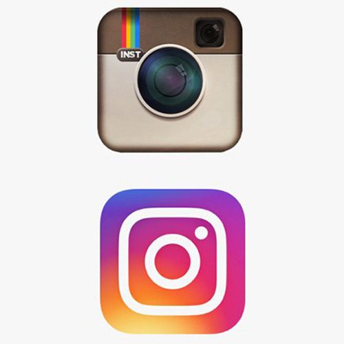
The history of photography, from the basic Polaroid camera to front-facing cameras on smartphones, is brilliantly reflected in the tale of Instagram’s iconic emblem. The Polaroid camera served as the basis for the original Instagram logo. In 2016, Instagram unveiled a simplified version of the logo as a bold geometric gradient to depict an abstract camera, following various revisions to its color and style.
The younger generation, which prefers minimalism with vividness, appears to have taken to the 2016 logo well. Recently, Instagram made a small change to the colors of the logo. Given that it is well known that the brand has benefited from selfies taken by its customers, it switched from displaying a polaroid camera to a phone camera.
- Starbucks coffee

Starbucks Coffee
One of the most contentious logos is that of Starbucks, the meaning of which has long been a mystery.
The well-known coffee company’s emblem features a Greek-style mermaid holding two fish in each hand. According to legend, the same as sirens seduce sailors, the brand wants to seduce coffee enthusiasts.
